Whether you're building a website or mobile application, it's important to prioritize user interface (UI) design on mobile devices first and foremost.
In the early days of mobile apps, designers started with the desktop experience, then used Bootstrap or React to scale it down. Now, mobile users have overtaken desktop users, especially in retail, financial, and healthcare. In the last quarter of 2022, mobile devices (excluding tablets) accounted for 59.16% of global web traffic.
If you want to give your growing base of mobile first users a great experience, your design and testing practices need to follow this shift. This guide offers you some tips on how to implement mobile first design and which testing practices ensure a great mobile experience for your users.
How to Implement Mobile-First Design
This section covers some basic rules of thumb when opting for mobile first UI design.
1. Research and prioritize page content
When users access your site or app, they want to see what they care about the most first. Think daily deals for an e-commerce site or the latest updates for social media.
Since smartphones have limited screen space, it's even more important for mobile developers to prioritize page content so that users don't get irritated by scrolling endlessly to find what they're looking for.
That means that instead of jumping right in and crafting interface mock-ups or prototypes, you need to research and prioritize the expectations users have for page content. User research helps guide your design decisions when you're coding, testing, or debating options with team members.
Content that customers aren't immediately looking for should be categorized based on its order of importance. For instance, if you run a travel app, customers should see a "book flights" option after navigating to the home page. Secondary page content such as the search bar or sidebar links should take up less space on your mobile UI.
2. Be mindful of UI breakpoints
After outlining your mobile app's interface, it's essential to build your app or web page off of the smallest breakpoints first before scaling up to tablet- or desktop-sized breakpoints. It's easier to enlarge HTML elements from mobile designs than it is to compartmentalize UI elements from desktops into tiny screen sizes.
It's also important not to define breakpoints based on device size. The sheer number of mobile operating systems available on the market makes this impossible. Using common breakpoints for screen sizes that your customers regularly use is best.
Lastly, you should designate breakpoints based on content requirements rather than on specific operating system (OS) layouts.
3. Use lightweight graphics and images
Images and graphics are usually the most data-heavy files for your mobile app to load and comprise 64% of the average load size.
Optimizing digital media files by compressing them can significantly boost mobile performance. Reducing byte size also lets you store more multimedia in your mobile web page's memory space and reduces the bandwidth required to load media overall.
You can also go a step further and improve your image delivery system by using caching headers. These allow your users' devices to use cached versions of images instead of redownloading them every visit.
4. Consider the thumb zone
Since 75% of mobile users operate their mobile devices with their thumbs, it's easier for them to interact with your site or app if you strategically place important UI elements where they can interact with them with their thumbs. This is known as the "thumb zone."
The key elements of thumb-friendly design are navigation, swipe tracking, and UI elements such as buttons.
To implement the thumb zone, ensure you're avoiding the edges of the smart screen, as they're hard to reach for most people. Also, avoid placing UI elements that require users to stretch their thumbs out. While it's not a deal-breaker, it can become irritating the longer customers use your mobile web page.
5. Understand demographics (and font sizes)
Some apps have their own custom font, created in a custom size, which can create a problem for users to need to adjust the text size. Some apps also place text within windows of a fixed size, or in fixed-width columns, which don't account for a system-wide change to the text size.
This can lead to frustrating experiences, where text gets cut off or obscured, with no way to fix it.
An example would be for a payment app: imagine that a user has increased the system font size to extra-large, but the designer only ever tested with the default. The user tries to enter a number with a decimal, which results in "49" being truncated to "4...", and the user can't see the number unless they shrink the text size back down.
This and other accessibility considerations can significantly degrade a user's experience on your app, and cause them to look elsewhere to get what they need.
6. Keep the navigation bar minimal
Creating a simple, responsive navigation bar helps avoid cluttering up your mobile home page. Luke Wroblewski said it best: "As a general rule, content takes precedence over navigation on mobile."
Mobile users want on-the-spot solutions, not navigation options. Instead of creating traditional horizontal or vertical navigation bars as seen on desktops, opt for a hamburger icon that users can click. It lets them access the content they're after while navigating your web page, too.
7. Avoid sudden pop-ups
Pop-ups are irritating on desktops. They're even more so on mobile devices due to space constraints.
Where possible, disable pop-ups. If you're dead set on using pop-ups for marketing purposes, consider using a solution like Sleeknote to help make your pop-ups more mobile-friendly. Sleeknote uses a click-trigger feature that allows visitors to disable pop-ups by clicking anywhere on the screen. It also excludes any existing email subscribers from receiving pop-ups when using your site.
How to Implement Mobile First Testing
Deploying a mobile first design should include functional tests (such as automated end-to-end testing) and non-functional tests (such as usability testing) to verify that your design strategy works as intended and that your site is responsive on the major mobile browsers.
Test on real devices under real conditions
The best way to determine if your interface renders as intended is by validating UI elements with a balance of real devices under real conditions, as well as emulators and simulators.
Testing on real devices means you're testing in the same conditions your users will be experiencing, which will most likely give you the most accurate test results. You can test on real devices in the cloud or your own device lab. However, managing physical devices in your own device lab or device farm comes with major downsides, including a high cost, operational burden, and inability to incorporate automated testing.
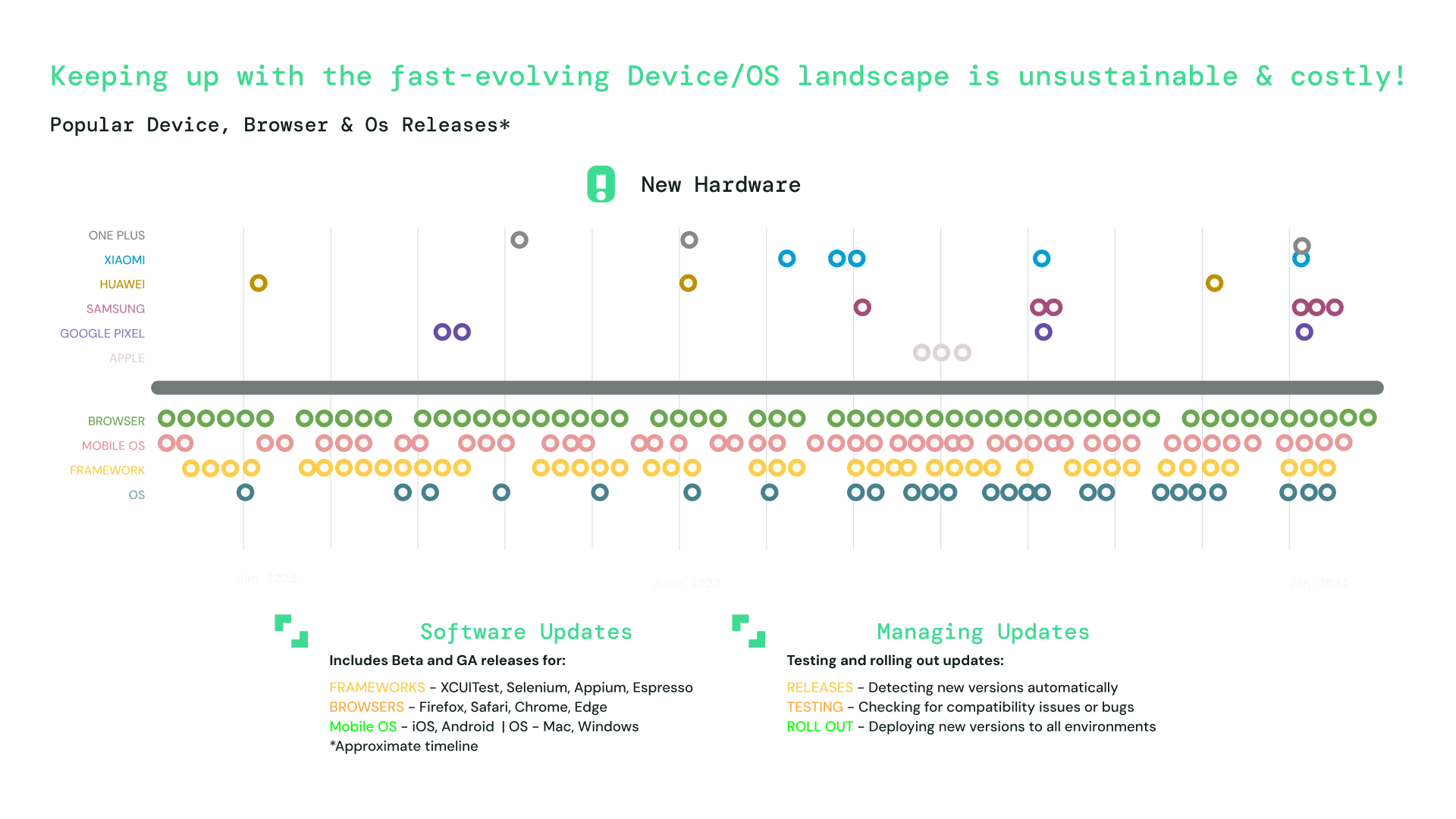
To put this into perspective, review the diagram below which illustrates the sheer number of devices and operating systems (in beta and generally available) your team will be responsible for keeping track of using an on-premises infrastructure.
A more effective alternative is to use a combination of real devices in the cloud with emulators and simulators to test how different operating systems function on real devices in live environments. For example, the mobile emulators and simulators Sauce Labs offers provides a wide range of real devices, including iPhone, iPad, Samsung Galaxy, Google Pixel, and Xiaomi devices.
Review performance indicators
After designing your minimum viable product, it's important to test features on different popular browsers, such as Chrome and Safari. Cross-browser testing lets you examine performance indicators per browser session and determine strategies to fix low-functioning features.
It doesn't have to be as time-consuming as it sounds, either. The Sauce Cross-Browser solution lets you test your mobile web pages in parallel on the cloud across thousands of browser and OS combinations. It includes video recordings of your entire test run with log files that let you share results among your team members to identify bugs.
Make the most of automated end-to-end testing
After developing all the features of your mobile app, it's important to use automated end-to-end testing to validate system functionality from start to finish.
End-to-end testing is important no matter what design methodology you're using, because you need to ensure all systems work as intended. It's particularly important for mobile first design because it can catch visual bugs such as misaligned buttons, responsive design issues, and more before you hit production.
End-to-end testing used to be a cumbersome manual process, but these days it's mostly automated. It's even easier to do it using a platform like Sauce Labs, which offers automated mobile app testing in the cloud.
Let real users test your design
Usability testing is the best way to get a true picture of how mobile-friendly your app is. It involves recruiting representative users to perform predefined tasks to test your app's ease of use and learnability and determine the overall user experience.
Depending on your objectives, you can opt to conduct tests in either remote settings or lab-based environments.
If you're interested in observing how your customers naturally interact with your app, you can employ third-party applications to send your mobile app to participants interested in testing your product.
Mobile app distribution is a way to test more efficiently without compromising security. Learn how streamlined and secure mobile app distribution, powered by TestFairy, can help your teams accelerate development cycles, enhance beta testing efficiency, and reduce app risk.
Are You Optimizing Your Mobile Design and Testing?
When customers open your app or browse your website on their smartphone, they want an easy, stress-free experience that keeps bringing them back. Mobile first design and testing ensure that your app or site offers a great experience.
When it comes to design, remember to research page content and prioritize it according to what your users want. In addition, be mindful of breakpoints, use lightweight images and graphics, keep the navigation bar minimal, and avoid sudden pop-ups.
When validating your mobile-first design, don't neglect functional test methods. Employ cross-browser testing, end-to-end testing, and usability testing, and be sure to test your UI under real-world conditions across all relevant devices and operating systems.

Share this post
