
Modern websites should work seamlessly across devices, from ultrawide desktop displays to narrow portrait smartphones. Sites that automatically scale to the user’s viewport offer a smoother browsing experience, making it more likely visitors will return.
Websites that adjust their layout as the viewport resizes implement the responsive design pattern. They’re built using media queries, a crucial feature of the CSS language that lets you selectively apply styles based on device characteristics such as width, height, and orientation.
Breakpoints and Responsive Design
What are CSS breakpoints? Breakpoints are the steps where a website’s layout snaps to match a new viewport size. You set breakpoints so the correct sections of the UI appear and disappear as the available space changes. They’re used to reflow content for different devices, conditionally reveal UI elements that are hidden on smaller screens, and adapt to alternative rendering modes such as printer output.
Most sites use several key breakpoints to switch between major layouts. These are normally correlated with the mobile, tablet, and desktop device families. Popular CSS frameworks all include their own predefined breakpoints:
Framework | Small (Mobile) | Medium (Tablet) | Large (Small Monitor) | Extra Large (Large Monitor) |
576px | 768px | 992px | 1200px | |
N/A | 723px | 933px | 1127px | |
640px | 768px | 1024px | 1280px |
This diagram shows how each breakpoint increases the available container width within the Bootstrap framework:
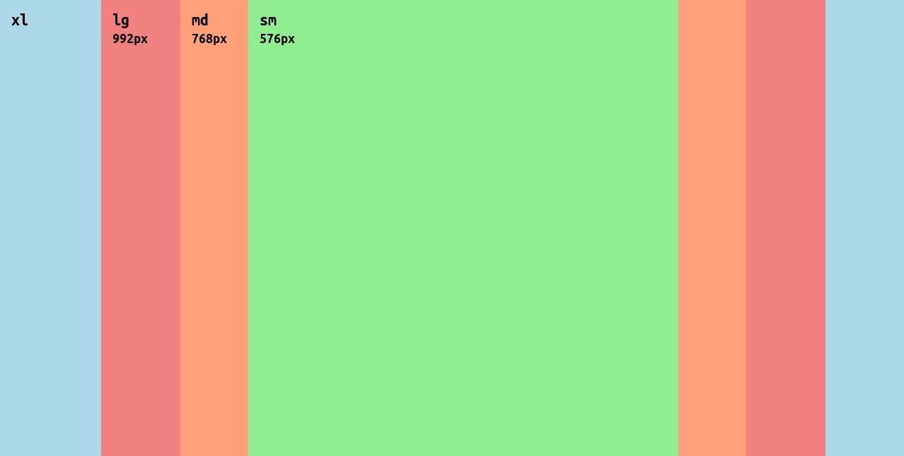
All three frameworks move to the next layout at a similar breakpoint. The exception is Semantic UI, which adopts larger layouts earlier (at smaller viewport widths) than either Bootstrap or Tailwind. Below their smallest breakpoint, all the frameworks size elements to fill the entire width of the screen.
Selecting Breakpoints
Most sites end up adopting a set of primary breakpoints similar to those listed above. They’re prevalent within frameworks for a reason, as the values neatly correspond to most common device types. Typical phones have a CSS width below 600px, while tablets are usually under 1000px.
You shouldn’t be constrained by these breakpoints, though. There are so many combinations of viewport and content that it’s impractical to expect all sites to work well with a framework’s built-in ranges.
Add a breakpoint when your layout starts to break, elements are absurdly sized, or content becomes difficult to read, such as paragraphs that are too wide for your eyes to scan. You can identify natural breakpoints by testing your site with a tool like Sauce Labs, where you can quickly compare popular viewports.
Using CSS Media Queries to Implement Breakpoints
You can add breakpoints to your CSS styles using media queries. Media queries support many conditions, including viewport width, orientation, aspect ratio, and the user’s preferred color scheme. The styles you nest inside the query will be applied when the condition matches.
A Basic Example: Reflowing Grid Columns
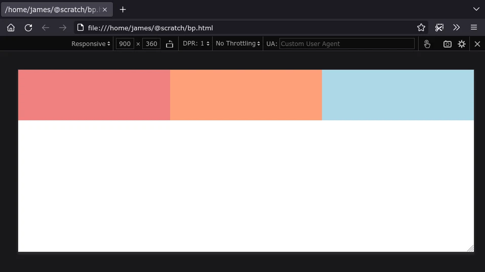
Reflowing a multicolumn grid layout for mobile devices is one of the most common responsive design requirements. Here’s a CSS snippet which does just that. Copy the code, save it to index.html, and open the file in your web browser:
1<!DOCTYPE html>23<html>4<head>5<style>6.container div {7width: 100%;89height: 200px;10}1112.container div:nth-child(1) {13background: lightcoral;14}1516.container div:nth-child(2) {17background: lightsalmon;18}1920.container div:nth-child(3) {21background: lightblue;22}2324.container {25display: grid;2627grid-template-columns: 1fr;28}2930@media screen and (min-width: 576px) {31.container {32grid-template-columns: repeat(2, 1fr);33}34}3536@media screen and (min-width: 768px) {37.container {38grid-template-columns: repeat(3, 1fr);39}40}41</style>42</head>4344<body>45<div class="container">46<div></div>4748<div></div>4950<div></div>51</div>52</body>53</html>54
The breakpoints match the mobile and tablet sizes used by the Bootstrap framework, but you can change them for your site.
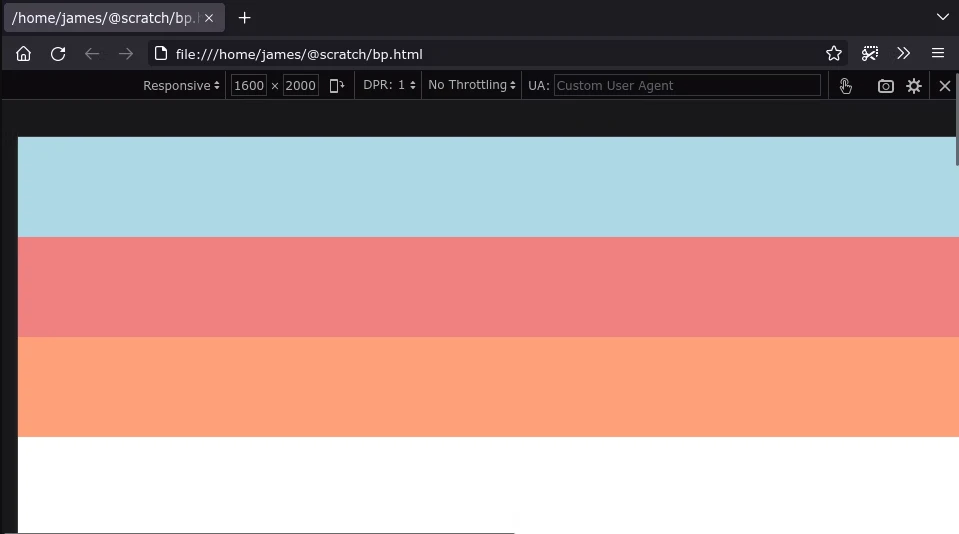
Try loading the page on a tablet or desktop device with a viewport width larger than 768px. You’ll see the three colored <div> elements displayed in individual columns:
Now resize your browser window or load your page on a phone. The colored elements will collapse into a single column when the viewport width goes below 576px:
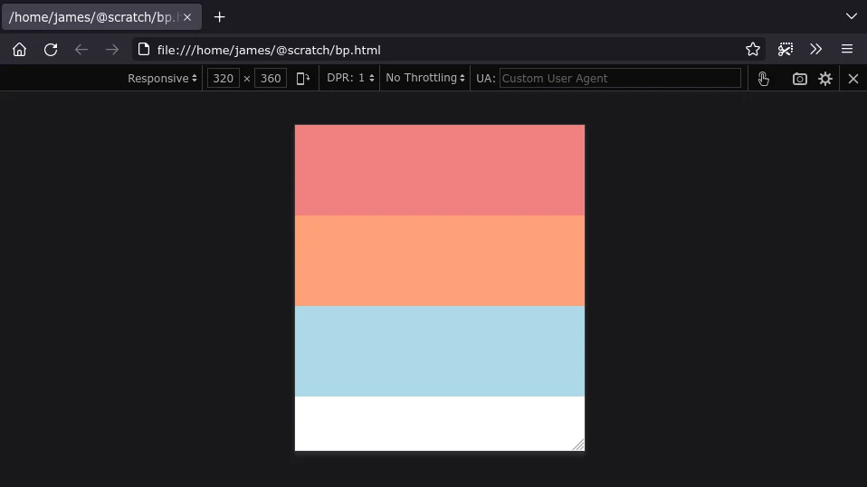
The CSS works by initially defining the grid as having a single column. Two media queries then progressively enhance the layout by adding columns as the viewport expands. The min-width condition won’t apply the nested styles unless the viewport is at least as wide as the breakpoint you specify.
Changing Other Styles
You can use any valid CSS style definition within a media query. Although the columns now collapse, it might be the rightmost one that holds your most important content. That column becomes the bottom row on mobile devices, so it’s hidden unless you scroll down. You could address this by expanding your media query to reorder the items:
1.container div:last-child {2order: -1;3}45@media screen and (min-width: 576px) {6.container {7grid-template-columns: repeat(3, 1fr);8}910.container div:last-child {11order: unset;12}13}14
The last element in the grid is targeted and assigned a default order of -1, meaning it will render as the first element. Inside the media query, the order gets reset to its default value when the viewport is big enough. This restores its natural order so that it still appears as the last element on larger devices.
Querying Orientation
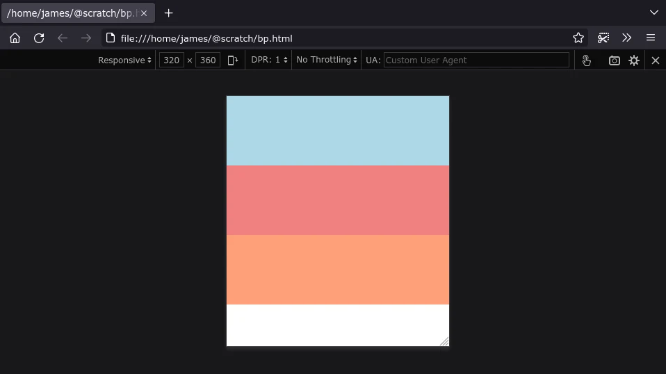
Some sites might need layout adjustments based on orientation, regardless of the viewport’s actual size. You could decide that columns will always collapse into rows when a portrait device is used.
This example defaults the grid to having three columns but collapses them whenever the viewport is portrait:
1.container {2grid-template-columns: repeat(3, 1fr);3}45@media screen and (orientation: portrait) {6.container {7grid-template-columns: 1fr;8}9}10
Now the columns collapse when the viewport is portrait, even if it’s a large device:
Customizing Printed Styles
Media queries are also used to customize your webpage’s printing styles. You can set the media type—the first keyword in the query—to print instead of screen.
When a media type is specified, the styles will only apply when the page is rendered in that context. The print type is activated when you print the page, while screen refers to normal browsing on a device. You can mark styles as suitable for both types using the all keyword.
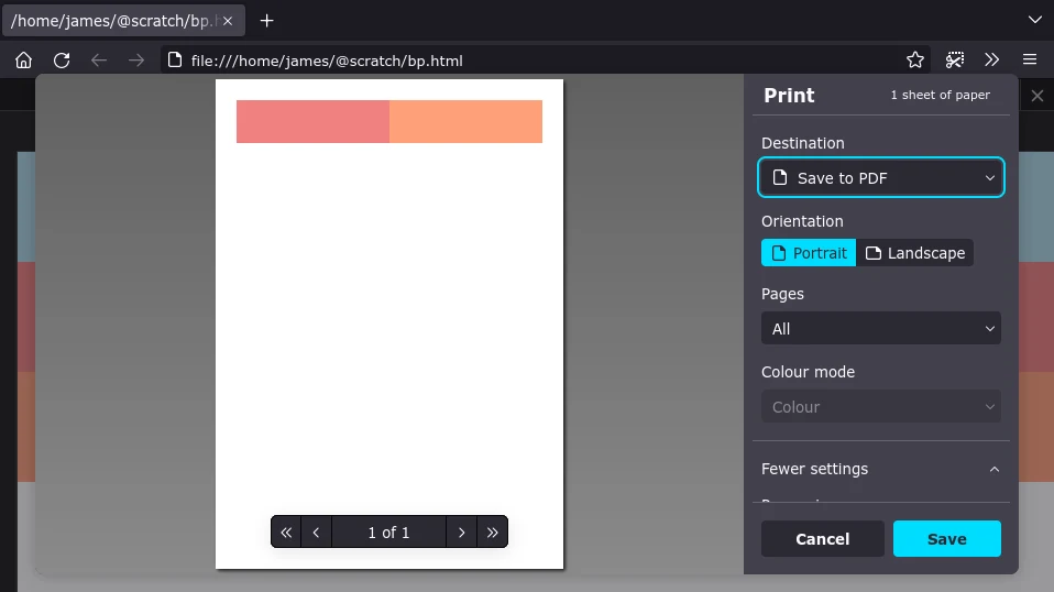
Multicolumn layouts are often too wide to print cleanly. You can use a print media query to force the grid to collapse when the page is printed:
1.container {2grid-template-columns: repeat(3, 1fr);3}45@media print {6.container {7grid-template-columns: 1fr;8}9}10
You can still use additional conditions with print queries. This one retains the columnar layout but drops the last grid item when portrait paper is used:
1.container {2grid-template-columns: repeat(3, 1fr);3}45@media print and (orientation: portrait) {6.container {7grid-template-columns: repeat(2, 1fr);8}910.container div:last-child {11display: none;12}13}14
Media Query Gotchas and Best Practices
Selecting the right breakpoints and creating media queries that implement your design can be troublesome. Here are a few common gotchas to look for if you run into problems.
Media Queries Don’t Affect Specificity
Media queries have no effect on specificity. It’s a common misconception that styles nested within a media query are automatically more specific.
The CSS snippet below won’t have the desired outcome. The element will always be blue, even if the viewport is smaller than 576px. The default styles are written after the media query, so they always overwrite its contents:
1@media all and (max-width: 576px) {2.container div:nth-child(1) {3background: lightcoral;4}5}67.container div:nth-child(1) {8background: lightblue;9}10
You can fix this by either positioning the media query after the default styles or using a more specific selector within the media query:
1@media all and (max-width: 576px) {2body .container div:nth-child(1) {3background: lightcoral;4}5}67.container div:nth-child(1) {8background: lightblue;9}10
Browser Compatibility Issues
The basic media query syntax is now a long-established part of CSS. However, newer components such as advanced level 4 selectors are not universally supported, so you might still run into problems where some styles don’t work in all browsers.
You can find any lurking issues by thoroughly testing your site with as many devices as possible. Use a testing platform like Sauce Labs to check whether your CSS behaves consistently in all major browsers, such as Firefox, Chrome, Safari, and Opera.
Be Careful with Overlapping Breakpoints
A common cause of buggy styling is breakpoint ranges that overlap:
1.container div:nth-child(1) {2background: lightcoral;3}45@media all and (min-width: 576px) {6.container div:nth-child(1) {7background: lightslategray;8}9}1011@media all and (max-width: 576px) {12.container div:nth-child(1) {13background: lightgreen;14}15}16
When the viewport width is exactly 576px, both media query rules are valid. The min-width and max-width conditions each evaluate to true because they include 576px in their range. The element turns green because that media query is written last. However, you might expect the element to turn gray, especially if styles are being applied by multiple different files.
You need to adjust one of the queries to eliminate the ambiguity. You can tweak the min-width breakpoint to apply from 1px above the max-width breakpoint, as in the example below, or reduce the max-width breakpoint instead:
1.container div:nth-child(1) {2background: lightcoral;3}45@media all and (min-width: 576px) {6.container div:nth-child(1) {7background: lightslategray;8}9}1011@media all and (max-width: 575px) {12.container div:nth-child(1) {13background: lightgreen;14}15}16
Use a consistent approach across all your site’s breakpoint ranges to prevent overlapping styles from occurring.
Px vs. Em vs. Rem in Media Query Conditions
The px unit (pixels) creates absolute values, whereas ems and rems are relative. Em units are relative to the parent element’s font size, while rem units are relative to the font size of the <html> element. It’s good practice to use em and rem to size elements in your design because they provide a degree of automatic scalability based on the user’s device and surrounding content.
Using em and rem in media query conditions can be confusing, though. The units behave differently in this context, referring to the initial font size of the browser and not any changes made in your CSS. This means 1rem in your media query condition might not be the same as width: 1rem in a style:
1html {2font-size: 10px;3}45p {6/* 20px */78font-size: 2rem;9}1011/* Applies at 800px, not 500px! */1213@media (min-width: 50rem) {14p {15/* 15px */1617font-size: 1.5rem;18}19}20
Most browsers use 16px as their default font size. The CSS above changes this to 10px, so 2rem is equivalent to 20px. However, CSS media queries continue to be evaluated using the original 16px size, so 50rem in the media query resolves to 800px (50 * 16) and not 500px (50 * 10).
Sticking to px units in your media query conditions creates the most predictable results.
Conclusion
In this article, you learned about several ways in which media queries give you the flexibility to assemble complex responsive designs.
Website visitors expect to be able to visit from any device and still enjoy a comfortable browsing experience. To achieve this, you need to define breakpoints that adapt to different viewport sizes by reflowing the layout and selectively showing elements.
CSS media queries let you swap out parts of your stylesheet depending on the viewport’s characteristics. Any styles written within the media query will only apply when its condition matches, such as the browser being desktop-sized and in landscape orientation. If you don’t use media queries, you’ll probably find that parts of your site overflow or become unusable at extreme sizes.
You can make your own site adaptive by testing different viewports and setting appropriate breakpoints. The Sauce Labs cross-browser testing platform provides access to hundreds of real and emulated devices so you can check that your site works seamlessly for all your visitors. Start cross-browser testing with Sauce Labs today.).
