Every web developer faces this problem once the website is implemented: cross-browser layout testing. This is a very annoying task as you have to look at your website on a lot of different browsers. We used to perform a manual check on all these browsers at the end of website development, and as a result we get some layout issues and have to find hacks to fix these deffects. But what if we could automate layout testing of the website and perform it always in all major browsers? Imagine you follow a TDD technique in your front-end development and you want to have an early feedback on layout issues. To solve this problem you could have a look at Galen Framework. In short Galen Framework is a layout and functional testing framework that has its own language for describing the layout. The way you test layout using this approach is by declaring a set of elements on the page and rules describing where each element is expected to be. The elements are being tested relatively to each other. This way you can make your tests very flexible and run them on different browsers and even mobile devices in case your website is responsive. In this article I would like to show you how to write a basic layout test and run it in the SauceLabs cloud. SauceLabs offers various platforms and browsers and even allows you to choose browser versions. Lets take the major browsers like: Internet Explorer 11, Firefox, Chrome, Opera and Safari on Mac. The website under test will be http://testapp.galenframework.com.
Configuration
Download the latest Galen Framework version and install it. Once you have Galen installed just create an empty test folder anywhere on your file system. Go to that folder and create two files: homepage.spec
and crossbrowser.test
. The first one will have the specifications of the layout for home page. The website under test is responsive so normally you should also write layout specifications for different sizes. But in this article we will only cover the desktop layout so our tests will be simpler. And also one very important part - use spaces instead of tabs
for indentation. Tabs are ignored so you will get an error if you indent with tabs.
Writing tests
Put the following code in homepage.spec
file:
===============================================
header          css #header .middle-wrapper
header-icon     css #header-logo
header-text     css #header h1
menu            css #menu .middle-wrapper
content         css #content
===============================================

header
    width: 900px
    height: ~ 69px
    centered horizontally inside: screen 1px

header-icon
    width: 48px
    height: 48px
    inside: header 0px left, 5 to 15px top bottom

header-text
    inside: header 5 to 22px top bottom
    near: header-icon 15 to 30px right

menu
    aligned vertically all: header
    below: header 0 to 1px
    height: ~ 64px

content
    aligned vertically all: menu
    below: menu 0 to 1px
>In the code above we described the location of only 5 elements but that is enough for the demonstration for now. Galen Framework has a very comprehensive syntax which allows to describe any complex layout. If you would like to learn more about it you can read this article: Galen Specs language guide. In short what we have described in the test code above is the following:
The width of header, menu and content should be exactly 900 pixels and all of them should be centered on the screen
The menu should be below header and above content
Header icon should be located in the left side of header and be near header text
You don't have to learn the galen syntax to understand what is checked in it as the code is quite readable. Of course for more complex examples like repetitive components you will have to have a basic understanding of the syntax to be able to read the spec, but that is something for another tutorial. In this post, we will focus on Sauce Labs' integration.
Running tests in SauceLabs grid
>Now how shall we run all these checks on all major browsers? Lets put this code in the crossbrowser.test
file:>
@@ set
    sauceKey        325325-1515-235325325-2353253325
    sauceUser       ishubin
    gridLogin       ${sauceUser}:${sauceKey}
    gridUrl         http://${gridLogin}@ondemand.saucelabs.com:80/wd/hub
    website         http://testapp.galenframework.com

@@ table browsers
    | browserName   | gridArgs                                                               |
    | Safari on Mac | --browser "safari" --version 6   --dc.platform "OS X 10.8"             |
    | Opera         | --browser "opera" --version 12   --dc.platform "Linux"                 |
    | Firefox       | --browser "firefox" --version 34 --dc.platform "Linux"                 |
    | Chrome        | --browser "chrome" --version 39 --dc.platform "Linux"                  |
    | IE 11         | --browser "internet explorer" --version 11 --dc.platform "Windows 8.1" |

@@ parameterized using browsers
Home page on ${browserName} browser
    selenium grid ${gridUrl} --page ${website}${gridArgs}
        check homepage.spec
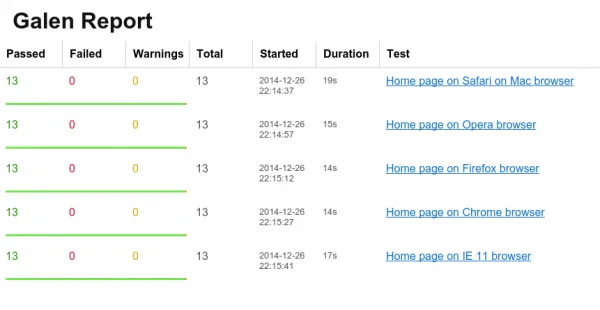
As you can see you will have to be registered at SauceLabs and obtain the key from it. Just replace the sauceKeyand sauceUserproperties with your own credentials. Now you can run the tests with this command: "galen test crossbrowser.test --htmlreport reports". Galen will run tests on all declared browsers and in the end of the test run it will create a folder with html reports. Just open the reports/report.html> file in your browser and you should get something like this:
Reports
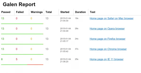
The website that we used for our tests looks ok on all those browsers. Now lets see how Galen can highlight the errors in case of broken layout. I have prepared a broken version of the website that is not showing well on Internet Explorer. Lets replace the website parameter in our test suite with the url http://testapp.galenframework.com/cross-browser-bug and rerun all the tests again. As you can see on the report below we have a lot of failures in Internet Explorer 11.
Lets take a closer look at the failures. Just click the test link in the report overview and you should get this page with detailed errors:
If you scroll down you will see the error message "header-text is -98px right which is not in range of 15 to 30px". If you click the red spec above this error message you will get a screenshot with highlighted elements on the page:
As you can see on the screenshot the header text is misplaced and that is why in our test report we get a message saying that it is located -98px to the right. It's actually not located to the right at all and that is why Galen gives us negative value. In the test we have specified that we expect the header text to be located from the right side of an icon with 15 to 30 pixel margin. The layout problem is quite clear and as you can see Galen was capable of catching this layout defect. And with help of SauceLabs Galen was capable of catching the layout issue in Internet Explorer. But SauceLabs offers not only cross-browser testing but it gives you a variety of mobile platforms with tablets and phones and with an ability to choose the device orientation. That means you can build a reliable test automation even for your responsive website and make sure it looks great on all mobile and desktop browsers. If you are curious about layout testing you can read more articles about Galen Framework on MindEngine.net website.


